5.2.3.8 Lab – Visualizing Data in Excel (Instructor Version)
Objectives
Part 1: Prepare Data for Visualization
- Install the analysis ToolPak.
- Create random numbers.
- Export a CSV file.
Part 2: Create Excel Charts for Visualizing Data
- Create a frequency distribution.
- Create and customize a column chart
- Create a scatter plot.
- Create a line graph.
Background / Scenario
Although Python and its extensions offer a very powerful set of tools for manipulating, analyzing, and visualizing Big Data, Excel can still be very useful. Excel includes a number of functions that can be useful for working on preliminary analyses and quickly generating charts for reports or presentations. Excel can not replace Python for analyzing large data sets, but it can help with exploration of smaller data sets.
In this lab, you will learn how to create data and export that data to a CSV file. You will then create and customize several types of data visualizations.
Required Resources
- PC with Internet Connection
- Microsoft Excel 2007 or later
- Excel Analysis ToolPak
- Excel student workbook file, “5.2.3.8-Visualizing Data with Excel Student Workbook.xlsx”
Note: The steps in this lab assume you are using Excel 2007. The location and precise steps for other versions of Excel may differ slightly. If you need assistance, use Excel’s built-in Help function or search the Internet for help with your particular version of Excel.
Part 1: Prepare Data for Visualization
Step 1: Install the Analysis ToolPak
The Excel Analysis ToolPak is an Excel Add-In that includes some useful utilities for data analysis and visualization.
a. Download and open the workbook file, “5.2.3.8-Visualizing Data with Excel Student Workbook.xlsx”.
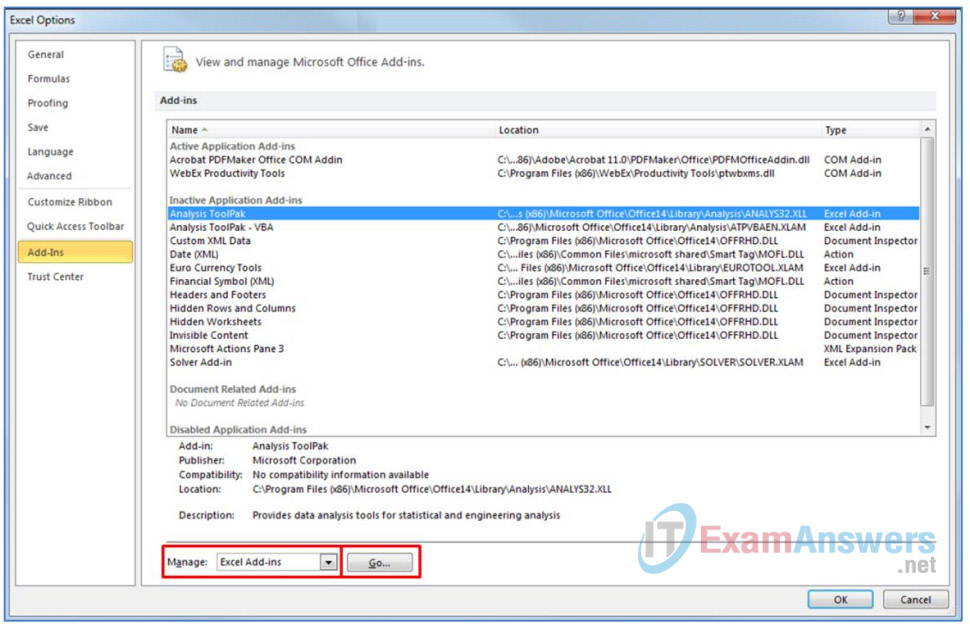
b. Go to the Excel File menu. Click Options from the selection on the left of the screen.
c. Go to the Add-Ins selection on the left.
d. In the drop-down list labelled Manage: at the bottom of the window, select Excel Add-ins, if it is not already selected.
e. Click the Go… button.
From the Window that appears, click the checkbox next to Analysis ToolPak as shown in the figure. Click OK.
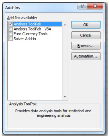
Note: If the Analysis ToolPak is not installed on the computer, you will prompted to allow it to be installed. This process is demonstrated here.
Step 2: Create random numbers.
The Analysis ToolPak has a tool that will create many different types of distributions of random numbers. We will use it to create a synthetic data set.
a. Open the Visualizing Data with Excel Student Workbook. With the Part 1 worksheet showing, go to the Data menu. You will see an icon in the ribbon called Data Analysis.
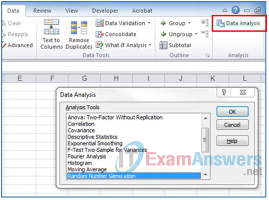
b. Click the Data Analysis icon, and the Data Analysis window will appear. Locate the Random Number Generation entry in the Analysis Tools list, select it, and click OK. The Random Number Generation dialog will appear, as shown below.
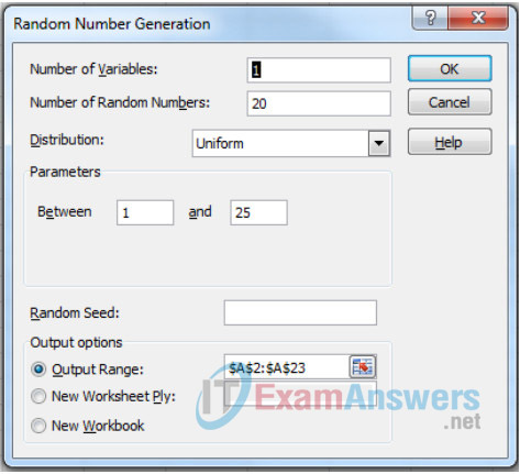
c. In the Random Number Generation dialog, select Uniform for the type of Distribution. A uniform distribution is one in which each value in the range of values in the distribution has an equal probability of being chosen.
d. Enter 1 in the Number of Variables field. This value indicates the number of columns of random data you want to create.
e. Enter 20 for the Number of Random Numbers. We will output these variables to rows in a single column.
f. Enter 1 and 25 for the range of values in the Between fields.
g. Select Output Range as the Output Option, and then click the icon to the right of the output range. Highlight cells A2 to A21 and press the Enter key. Click OK in the Random Number Generation dialog. The cells will populate with the random values.
h. Repeat the steps above, but this time set the Parameters field to between 100 and 300 Output the values to column B.
i. In row 1, enter Variable 1 and Variable 2 as headings for the columns.
Step 3: Export a CSV file.
Excel sheets can be exported as CSV files or text files with the columns of values separated by spaces or tabs.
When choosing a delimiter, especially with files that contain unstructured data, if the delimiter character appears as a value in any of the columns, unanticipated consequences will occur when the file is imported into Python.
Exporting to text file formats will remove many of the features of native Excel workbooks. For example, exported text files will not contain formulas, text formatting, or multiple worksheets.
a. Save the Excel workbook, but don’t close the file.
b. Highlight the cells in the range A1:B21 in the workbook that was created in Step 2 of this lab. Right-click the selection and select Copy.
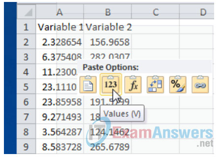
c. Open a new workbook file. Right-click cell A1 and select Paste – Values from under the paste options. All of the data from the previous workbook will appear in the new workbook.
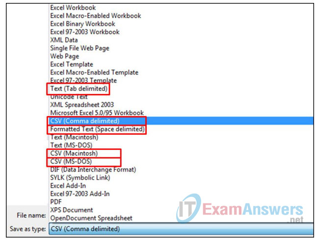
d. Go to the file menu and select Save As.
e. Enter a file name and choose CSV (Comma delimited) as the Save as type. Click OK to save the file. Warnings will appear regarding unsupported features of the file. Click Yes to continue creating the CSV file. Close the Excel CSV file after it is saved.
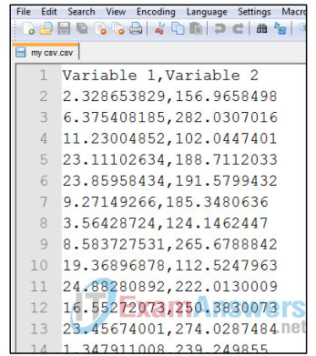
f. Open the CSV file in Notepad or another text file editor. It will have a .csv file extension.
Part 2: Visualize Data in Excel
In this part of the lab, you will create visualizations using the Excel charts feature.
Step 1: Create Frequency Data
A company is concerned about the levels of noise in various areas of its facility. They would like to get a sense of the distribution of noise levels in the building. In order to visualize the noise levels for the entire facility, a column chart can be used. This chart will present the number of areas of the building, as represented by the sensor values, and the levels of noise reported by the sensors
a. In the worksheet for Part 2 Step 1 and 2 in the lab workbook, create the data using the Analytics ToolPak. Create one variable for 50 sensors with a range of values from 5 to 75. Output the values to the range A1:A50.
b. Click cell B1. Type =round(A1,1). Press Enter. With cell B1 highlighted, double-click the small rectangular fill handle in the lower right corner of the highlighted cell. This will automatically fill the formula down to cell B50. You will now have rounded values with only one decimal place for the values in column A.
c. Remove the rounding formula from the cells in column B. To do this, copy the values in column B. Then right-click in cell B1 and Paste values.
d. Recreate the table below in cells D1:G9.
| Category | Low | High | Number of Sensors |
|---|---|---|---|
| Silent | 0 | 10 | |
| Very Low | 10 | 20 | |
| Low | 20 | 30 | |
| Moderately low | 30 | 40 | |
| Moderate | 40 | 50 | |
| Moderately high | 50 | 60 | |
| High | 60 | 70 | |
| Very High | 70 | 80 |
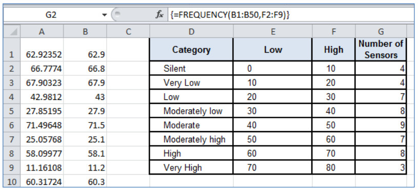
e. We need to find the number of sensors that detected the various levels of noise. To do this, we use the Excel frequency() function. The frequency function requires two inputs, the range for the data (B1:B50), and the range for the upper limit of each of the categories, or bins (F2:F9). In cell G2, type =frequency(B1:B50,F2:F9).
f. Fill this formula down from G2 to G9. The numbers will not be correct, but you will fix that in the next step.
g. This formula is an array formula. It is important to convert the range G2:G9 into an array. To do so, make sure G2:G9 is selected and press the F2 key. Then, press Ctrl-Shift-Enter. Because we are using random numbers as our data, your quantities will differ. Notice that the formula now has braces { } to indicate that it is an array formula.
Step 2: Create and Customize a Column Chart
a. Highlight the data in the range G2:G9.
b. Go to the Insert menu, and in the Charts section of the ribbon, click Column. Click the first chart icon under the 2-D Column section of the menu to create a clustered column chart.
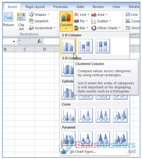
c. Click the chart to select it. The Chart Tools group will appear in the menu bar. The three menu tabs in the Chart Tools group allow a wide range of operations on charts. Click the Design menu tab. Locate the Select Data icon in the Data group of the ribbon and click it. The Select Data Source dialog will appear.
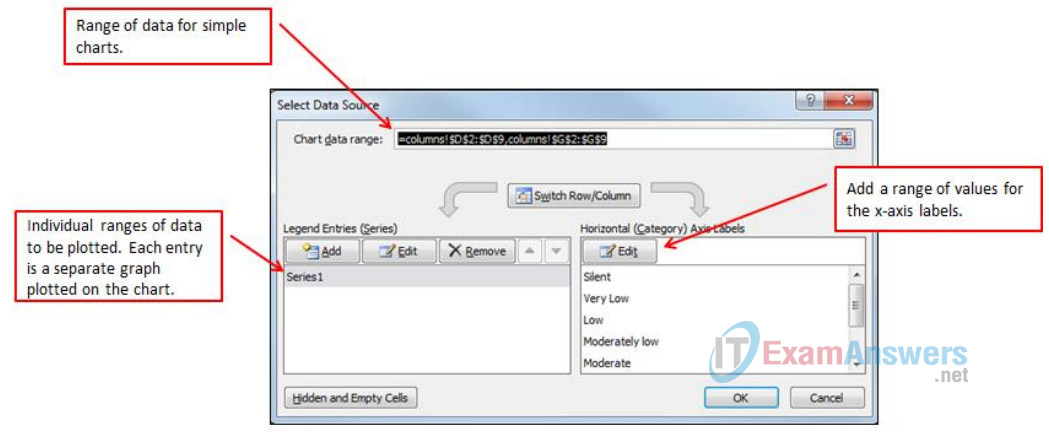
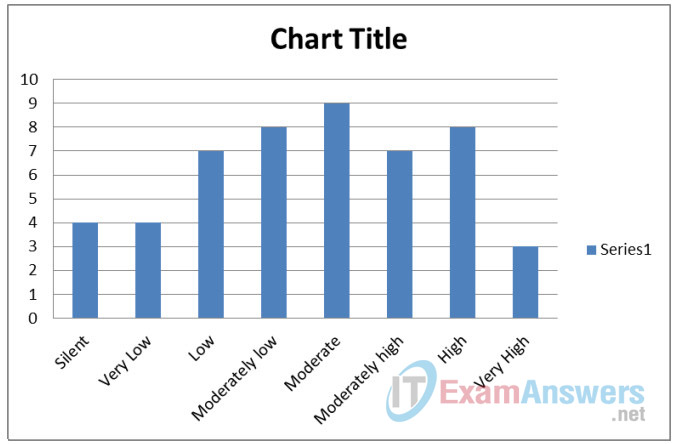
d. In this dialog, we can see the data range that is being visualized in the chart and some controls for entering data labels on the vertical and horizontal axis of the chart. Click Edit in the Horizontal (Category) Axis Labels box. Click cell D2 and drag to highlight all of the entries in the range down to D9. Press Enter. The columns will now be labelled with the categories. Your graph should resemble the one below.
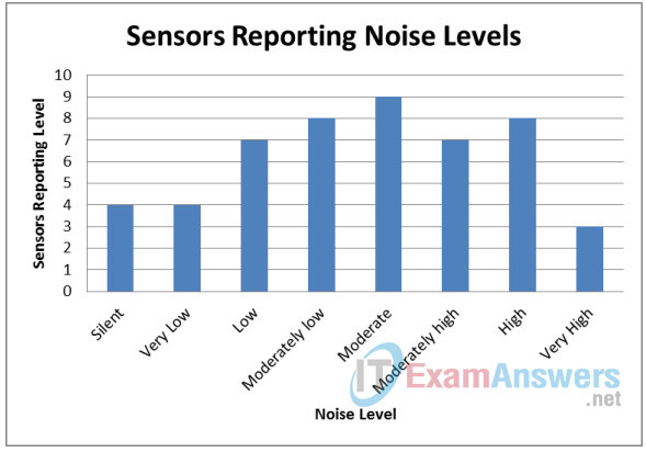
e. It is important to label the axes of your charts. Text boxes can be inserted in the chart for this purpose. Select the chart and go to the Layout tab of the Chart Tools menu group. In the Labels group on the ribbon, click Axis Titles. Highlight the Primary Horizontal Axis Title option and click to open the menu choices. Select Title Below Axis. A text box will appear below the horizontal axis.
f. Repeat the steps above for the Primary Vertical Axis Title, but this time choose Rotated Title. A text box will appear to the left of the vertical axis of the chart.
g. Select the text box under the horizontal axis and type Noise Level and press Enter.
h. Select the text box next to the vertical axis and type Sensors Reporting Level and press Enter.
i. Click the Chart Title text box and type Sensors Reporting Noise Levels and press Enter.
j. Click to select the legend entry Series 1 text box and delete it. Your graph will resemble the one below.
k. With the chart selected, open the Design menu in the Chart Tools group. Click Change Chart Type. Experiment with changing the chart type. You can quickly see that you would not want to use chart types like Line, Pie, and Scatter with this data. But you might want to use a Bar chart or another type of column chart.
l. Under Columns, try one of the 3-D charts. Select the chart type and click OK.
m. With the chart selected, open the Format menu of the Chart Tools menu group. In the Current Selection area of the ribbon, select Chart Area from the drop-down box, if not already selected. Click Format Selection. Select Fill and then click the Solid Fill radio button. Change the fill color or click to add a gradient or texture.

n. Click one of the data columns in the chart or select Series 1 as the Current Selection. Try different shape fills and shape outlines for the columns.
o. Go to the Layout menu. If you are working with a 3-D chart, click 3-D Rotation in the Background ribbon group. Try gradually changing the X, Y, and Perspective degree values. You will see your chart change.
These are a few of the things you can do to customize a chart. Many of these same options are available no matter what the chart type.
Step 3: Create Scatter Charts
In this step, we will visualize paired data as a scatter chart. We will work with a data set in the lab workbook that consists of the prices and sizes of houses sold in two cities. We will plot both of these data series in a single scatter plot chart and format aspects of the chart for readability.
a. Open the Step 2 Part 3 worksheet in the lab workbook.
b. Select all of the Price and Size values for the houses sold only in Union City (B2:C38).
c. Go to the Insert menu and the Charts group. Select the Scatter with only Markers chart type from the Scatter charts menu. This will plot the data for the Union City houses with the Price on the x-axis and the Size on the y-axis.
d. From the Design menu in the Chart Group, choose Select Data. Under Legend Entries (Series) click Edit. Under Series name, type Union City.
e. Click Add under Legend Entries. For Series name, type Small Town.
f. For Series X values, select all of the values for the Price of the Small Town houses. For Series Y values, select the range of Size values for Small Town. Click OK. You will see the scatter plot of Small Town price and size pairs appear on the graph.
g. The graph is not very useful the way it appears here. The Union City and Small Town plots are superimposed on one another, and the graph is bunched up at the lower end, close to the origin. We will adjust this first by formatting the markers that are plotted on the graph. Go the Layout menu in Chart Tools and Under Current Selection in the ribbon, select Series “Small Town”. Then click Format Selection in the same ribbon group.
h. Click Marker Options. Under Marker Type, select Built-in. For Type select a different shape from the drop down. Set the Size to 5 if it is not already 5.
i. Select Marker Fill from the left side of the dialog box and select the No fill option. For Marker Line Color select a blue color.
j. Experiment with similar settings for the Union City series. Your goal is to make the two series as readable as possible by formatting the markers so that they are distinct from one another.
k. Another customization that can be made to the graph is the scale of the axes. Excel tries to automatically scale the graph according to the range of values in the data series, but it doesn’t always work well. A good practice is to know the minimum and maximum values for the values plotted on the x and y axes. You can do this by using the min() and max() worksheet functions.
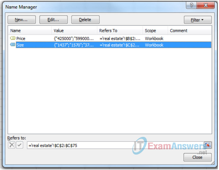
l. To find the minimum and maximum values, let’s first name the ranges of values. This feature makes it easier to refer to large data ranges without having to repeatedly select them. Click the cell that contains the heading for column B. To create a named range, go to the Formulas menu. Click Name Manager in the Defined Names group on the ribbon. Click New… in the Name Manager window. The heading for the column should appear as the Name in the New Name dialog. For the Refers to: entry, select or enter the range for the Price values. Repeat this process for the Size range. The name manager window should look like the figure below when you are finished. Close the window.
m. You will need to enter formulas in four cells. The values will be the Price and Size minimum and maximum values. An example format for these cells is shown in the figure. Click in the cell for the Price minimum value and enter =min(Price). Do the same using the max() function. Repeat this process for the Size range.
| Price | Size | ||
|---|---|---|---|
| Min | Max | Min | Max |
| 122500 | 1700000 | 728 | 5190 |
n. Chose Horizontal (Value) Axis from the Current Selection dropdown in the Chart Tools Layout menu.
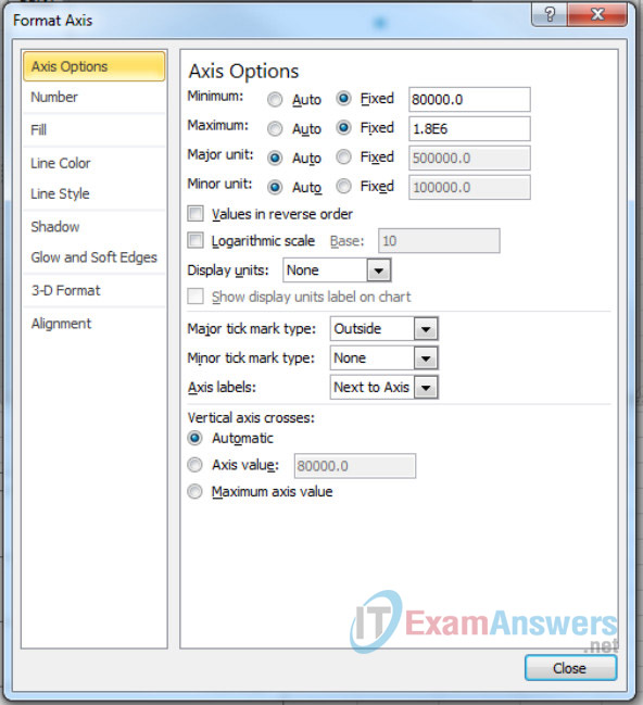
Then click Format Selection. In the dialog box, you can see that the values for the units and range of values shown on the axis can be adjusted a bit. Make the changes shown in the figure below. Experiment with different values and observe how the chart changes. Be sure that all values are plotted. If you adjust the values incorrectly, some data may not be.
o. Repeat this process for the vertical axis of the graph using the minimum and maximum values for Size as a reference. It is good to choose values that round up or down from the minimum and maximum. For example, 500 and 5300 are good values to use.
p. Finally, be sure to title the chart and add titles to the axes. It is important that the axes be labelled clearly and include the units for the data when necessary.
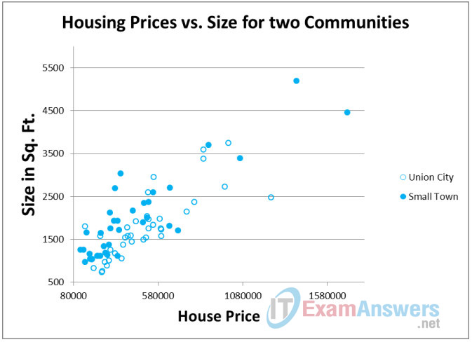
Note that the markers in the chart generally cluster around a line that reaches from lower left to upper right. This is expected, because houses generally increase in price as they increase in size.
Step 4: Creating Line Charts
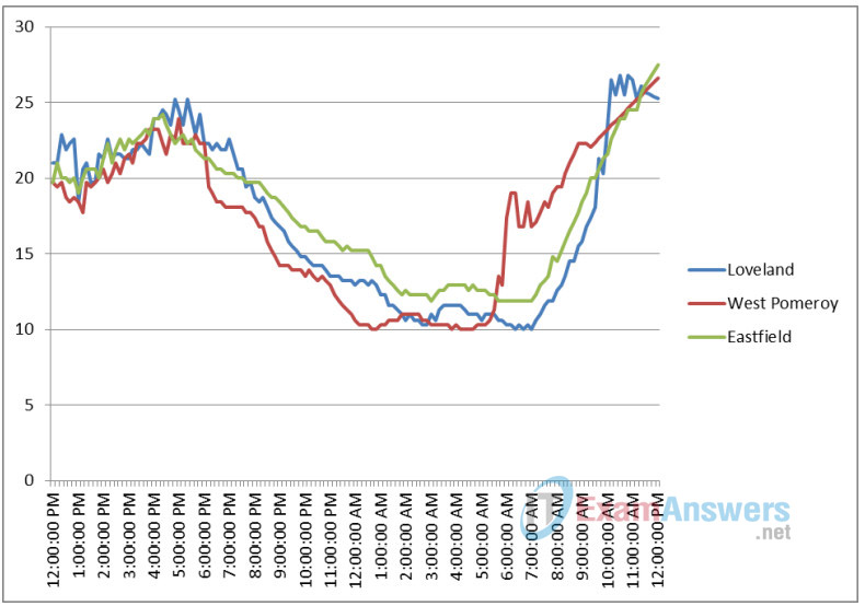
Line charts are very useful for visualizing trends in data. IoT data is frequently time-series data. It consists of values created by sensors that vary over regular periods of time. In this step of the lab, you will create a chart with plots of three data series that correspond to individual sensors that are at three different locations. The data is temperature data, and the time series includes observations made by temperature sensors that were performed in 10-minute intervals over a 24-hour period. The graph will be a visualization of the temperature data as it changes against time.
a. Move to the tab in the student workbook file for Part 2 Step 4 and take a look at the data.
Which values do you think will be used for the following components of the chart?
| Chart Component | |
|---|---|
| Series names | Loveland, Pomeroy West, Eastfield |
| x-axis data | timestamp |
| y-axis data | Temp |
b. With no data selected, insert a new line chart by making the menu selection shown in the figure.
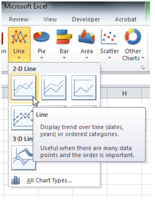 Right-click the chart and choose Select Data… from the menu. You will see the familiar dialog box. Click Add Series. Name the series with the first location. Add the range of temperature data for the location as the series data. Add the range of timestamps for the horizontal axis values.
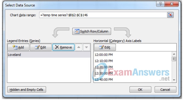
c. Repeat for the other two locations. You don’t need to redo the horizontal axis values because all of the observations use the same timestamps.
d. When you are finished, the chart should resemble the one below. In some versions of Excel, you will need to manually add the Legend.
e. Explore making changes to the chart format by trying different chart styles, colors, and axis settings. Label the axes and title the chart.
